Reviewed.com
Background
In 2014, USA Today acquired the consumer product review website Reviewed. Reviewed prides itself in being the best in the business at reviewing consumer products. It’s comprehensive testing lab was staffed by a team with all the right methods, credentials, and certifications—their competition would even use Reviewed’s work on their own product reviews.
Challenge
While Reviewed’s comprehensive testing processes were unmatched, their website was slow and difficult to navigate.
Despite the challenges on their existing site, Reviewed also needed to shift their focus as a business from digital advertising to affiliate marketing. With all of this in mind, Reviewed challenged us to reimagine the future of Reviewed—a future led by a new visual brand identity and best in class user experience.

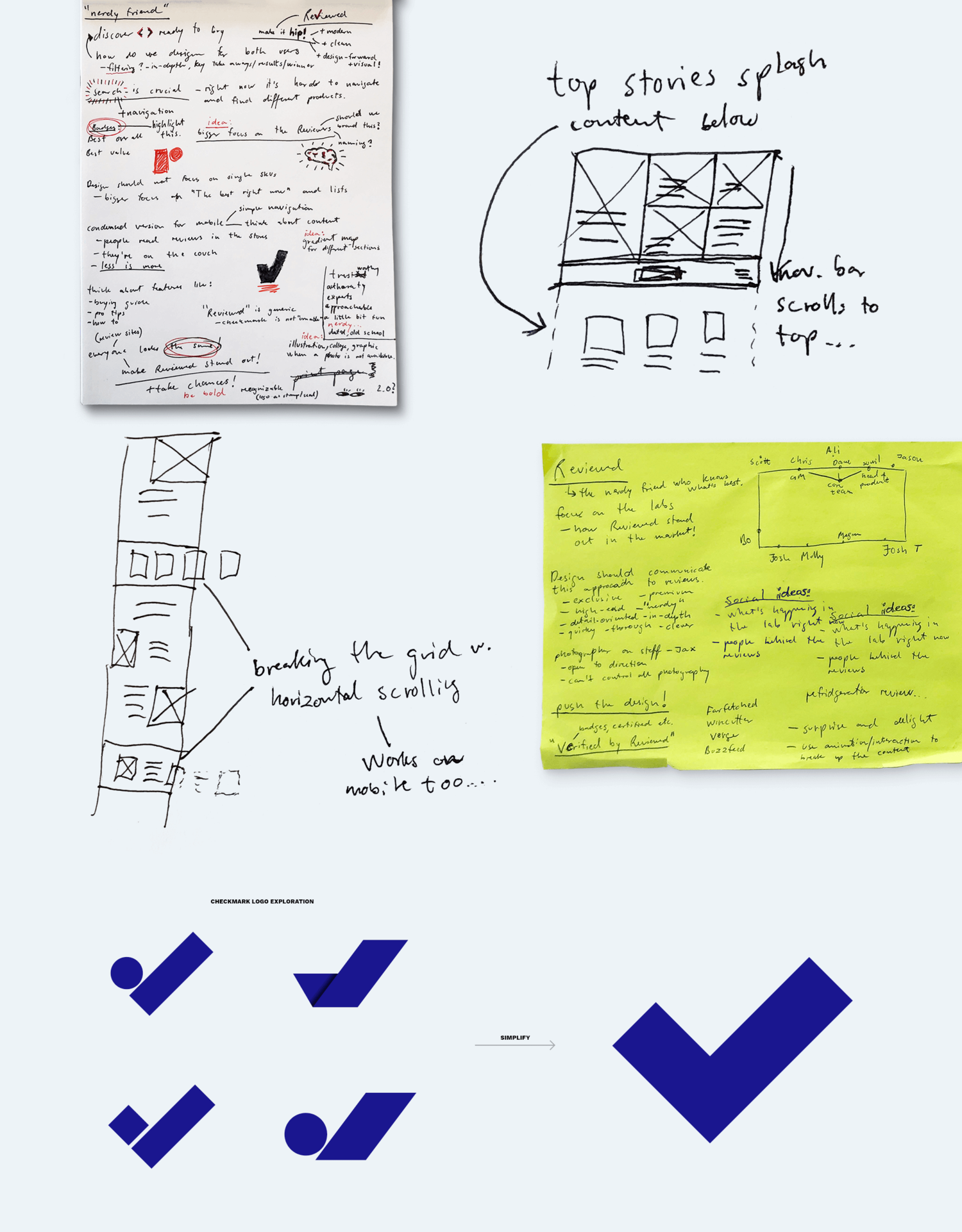
Our approach
To help Reviewed.com relaunch with a new visual brand identity and a best in class UX, our team accomplished the following:
- Held stakeholder interviews with Reviewed.com and USA Today department heads
- Identified unmet needs and distill key findings from user interviews
- Conducted a deep-dive UX audit of existing site and competitor sites, as well as a competitive and adjacent space analysis for feature inspiration
- Developed wires that could tackle unmet user needs while ensuring existing long-form content was properly incorporated
- Created, packaged, and proposed multiple new brand identities and logos for Reviewed
- Held joint ideation sessions with the stakeholder team at Reviewed to ensure clients were active participants in the design process
- Wrote all UX copy and long-form copy needed for Reviewed’s new website
Outcomes
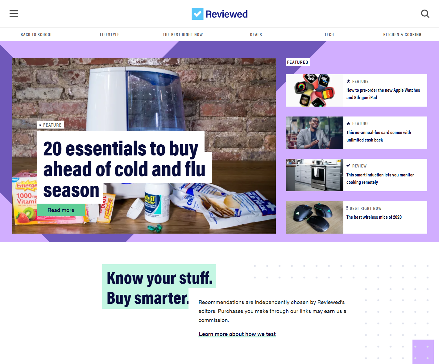
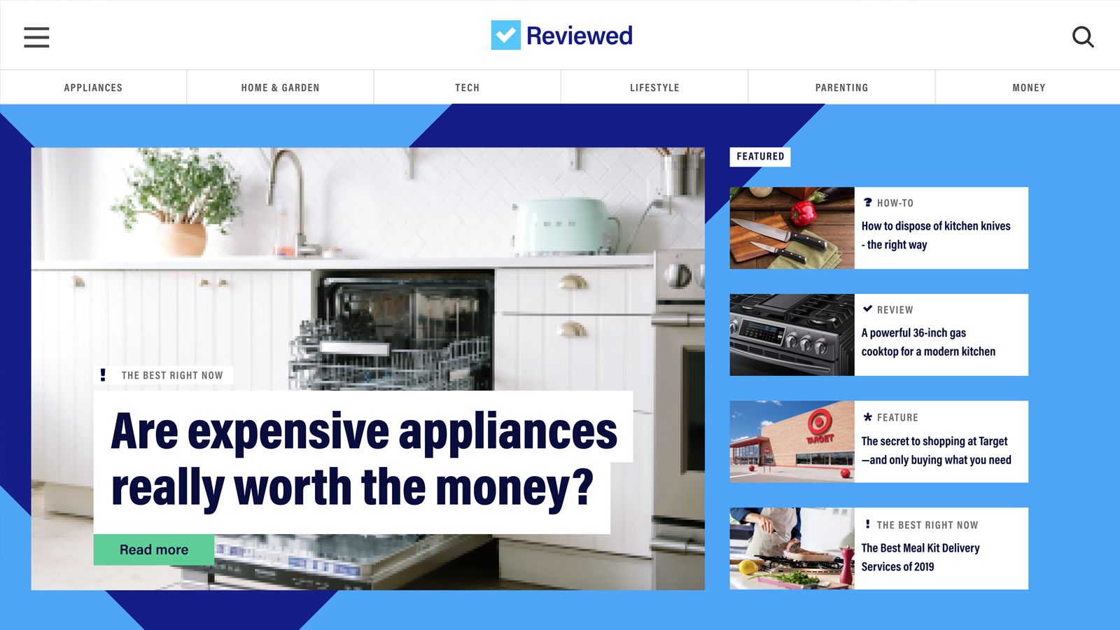
Through a people-centric design process, we identified the unmet needs of potential users of Reviewed.com, and redesigned all key pages of the site to simultaneously meet users needs and business objectives.
In addition, we developed a new design system for Reviewed to ensure they could easily build future pages in this new style.

Project samples & additional details
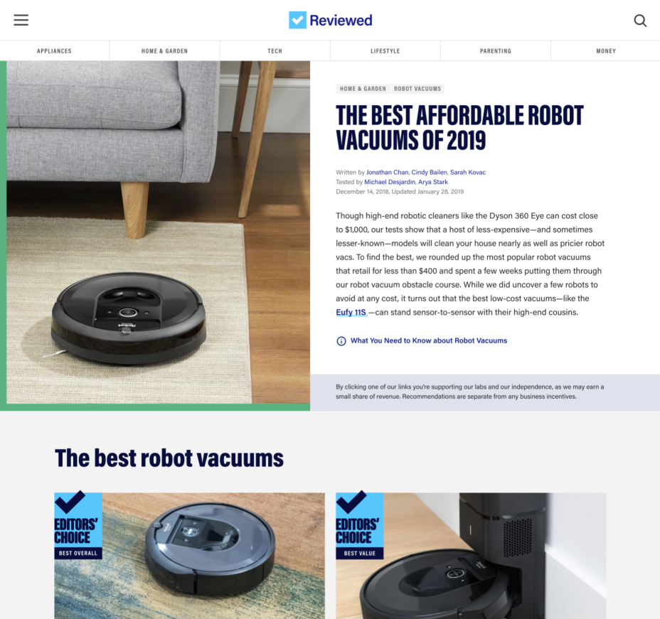
Their new site needed to accommodate all articles, regardless of length.